- Get started on your mortgage
- Buying your first home, next home, investing in property or just keen to review your mortgage?
- Apply online
- Put your savings to work
- Earn better returns and access your money with no penalties.
- Start investing now
The Preest Journal: Much ado about paint
I am absolutely dying to paint our lounge. We have painted a few test pots on the wall and I have just about picked a favourite now. The test patches have been up for a few weeks now and I am enjoying quizzing any visitors we have on which is their favourite.
But first, a story about our checkered history with paint.
In our last house we painted both bedrooms. We started with the spare room and envisaged a lovely soft grey. We painted it ‘Iron’ which, I will have you know, contained only white and black paint. White and black should only make grey one would think. It was the perfect colour on the bit of cardboard that we painted as our test patch.
The room came out looking baby blue. BABY BLUE!
I was heartbroken. We called my father in law (who was a painter) and his summary of what happens was basically that colours do weird things when painted on walls sometimes. Light reflects etc. and while, yes, you are supposed to paint your sample on a large bit of cardboard, the idea is that you move it around the room and see what it is like in different lights. But even if you follow all the test pot rules, some colours will look different when all four walls have been painted. Everyone who has ever visited that house will have heard this story. I liked to make sure that people understood that we did not pick that colour. We are not baby blue people thank you very much.
Moral of that story is that we now take choosing a paint colour VERY SERIOUSLY.
When we painted the next room we painted our samples in the darkest corner of the room, and on both sides of said corner to be sure to be sure. We took an age choosing and brought a fair few test pots in the process. In the end we picked a beautiful grey. It was Lyttelton half? Maybe quarter? It irks me greatly that I can’t quite remember which Lyttleton it was.
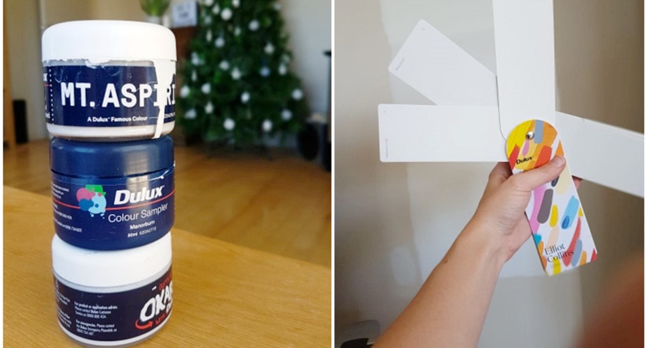
So for this lounge we are going for an off-white. We threw a grey in the mix just to see what we thought as well. So top to bottom we have Mt. Aspiring (creamy white), Manorborn and then Manorborn Half (grey white). If you can discern the difference on the computer screen then I would love to know your favourite.

Also for ages Dom tried to convince me that we should have a bit more colour somewhere! This went on for so long (it was actually him just joking around making me frustrated), that I am now seriously considering a super dark blue on one wall, kind of like this (bonus points because it’s called Tutukaka which is in my home town)
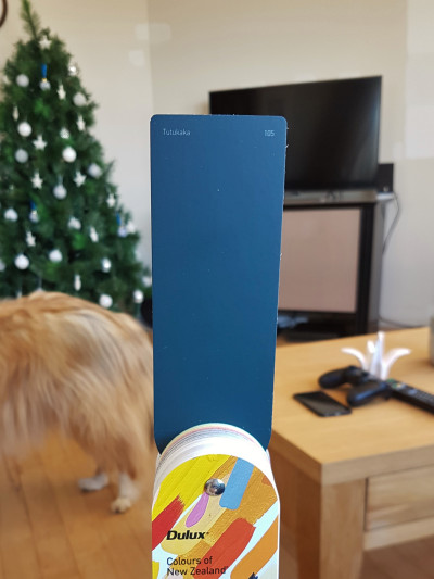
I think I might just do it. It looks much darker in real life. Trying to portray paint colours via a computer screen is not easy.
We also bought a colour wheel, because weirdly it’s something I have always wanted to own. Dreams do come true folks.
I would love to know your thoughts? What colours have you painted and loved? Or regretted?
Alisha x
This blog was written by Alisha Preest and has been used with her permission. You can view the original post here.
Top Reads:
- NZ Mortgage Rates and Housing Insights 2018
- Getting Started - First Home Buyers
- Mortgage Interest Rates
Enjoying our blog? Get the latest sent straight to your inbox
Receive updates on the housing market, interest rates and the economy. No spam, we promise.
The opinions expressed in this article should not be taken as financial advice, or a recommendation of any financial product. Squirrel shall not be liable or responsible for any information, omissions, or errors present. Any commentary provided are the personal views of the author and are not necessarily representative of the views and opinions of Squirrel. We recommend seeking professional investment and/or mortgage advice before taking any action.
To view our disclosure statements and other legal information, please visit our Legal Agreements page here.
